10 high-converting landing page examples for affiliate marketing: best practices for 2025

What is a landing page in affiliate marketing?
Basically, a landing page in affiliate marketing is just a webpage with a specific offer on it. The whole point of the page is to get the visitor to do something specific.
What kind of “something specific”?
Here are some examples of a landing page for affiliate marketing:
- Fill out a form (like a contact form or a sign-up sheet);
- Register for an account;
- Buy something;
- Sign up for a subscription;
- Put some money down (like a deposit);
- Call a phone number;
- Enter a contest.
Why does this matter?
When someone completes one of these actions, it’s called a “lead.” The media buyer (the person promoting the offer) and the affiliate program use leads to track how well things are going. They also get paid based on the number of leads they generate. What exactly counts as a “lead” depends on how the media buyer gets paid and what industry they’re in.
In short:
Landing pages are essential for affiliate marketing. You can’t really track results or make sales without them. They’re how you connect potential customers with the stuff you’re promoting.
A good landing page can make someone say, “Yes, I need this!” A bad one? They might just leave. If it’s not clear or seems off, you might lose their trust and a sale.
No matter if people find your page through ads, social media, or emails, the goal is always the same: get them to join your affiliate program.
Types of affiliate landing pages
First of all, landing pages can differ in layout for different types of devices. Let’s consider their varieties.
- Mobile landing page — a web page created exclusively for viewing on smartphones. On a desktop, it will be displayed as a narrow strip of content in the middle of the screen. Suitable for affiliate marketing, Dating, the Gaming vertical, and Mobile installs.
For some, the separation of landing pages into mobile and adaptive versions is fundamental. For example, products that are best suited for placement on Instagram are placed on simple mobile landing pages instead of adaptive ones.
- Adaptive landing page — a web page with a unique structure that allows it to be viewed from any device. It can be used in all verticals, except those that are designed for mobile devices, for example: Utilities or Mobile games.
- iFrame — is a form for ordering a product. Frames can be attached to the main landing page with the indication of a partner ID. They are used for Trial offers and Sweepstakes. In essence, it is a block for collecting information about conversions, which you can integrate into the landing page.
Landing pages are also tailored to different audiences and goals. A new visitor needs a different experience than a returning customer.
To help you understand which landing page is right for which situation, we’ve put together a handy table. It shows you the different types of landing pages, what they’re good for, and when to use them:
| Type of Landing Page | Key features | What’s it for? | When should you use it? |
| Squeeze Page | Super simple page. Minimalist design. Just enough info to get you interested, a big button, and a place to enter your email. Think “free ebook” in exchange for your email. | Mainly for collecting emails so you can send marketing stuff later. Builds an email list for lead nurturing. | Top of the sales funnel. Best for cold audiences and quick, low-commitment conversions. |
| Lead Generation Page | Longer form than squeeze pages. Asks for more info (name, company, job title, etc.). Often includes compelling headlines highlighting benefits. Usually offers something valuable in return, like a free guide or webinar. | Captures leads by gathering visitor information. Provides more qualified leads with detailed data. | Top and Middle of the sales funnel. Good for people who are interested but need a little more convincing. |
| Click-Through Page | No forms to fill out! Minimal distractions. Just a page with info about a product/service and a big button that takes you to the next step (like a “Buy Now” page). | Warms up visitors and directs them to the next stage of the sales funnel (e.g., a sales page, pricing page, etc.). Prepares leads for a purchase decision. | Middle of the sales funnel. Effective for nurturing leads and moving them closer to a purchase. |
| Sales Page (Short Form) | Concise and to-the-point. Assumes you already know about the product and just need a little nudge to buy. Focuses on key benefits and a strong CTA. | Directly sells a product/service. Best for impulse buys or low-cost items. | Bottom of the sales funnel. Used when the audience is already aware of the product/service and ready to buy. |
| Sales Page (Long Form) | Comprehensive and detailed.Lots of info, testimonials, FAQs, and everything you need to know before buying. Addresses potential objections and builds trust. | Convinces people to buy by giving them all the details and building trust. Good for expensive or complex products. | Bottom of the sales funnel. Ideal for high-value products/services that require more explanation and trust-building. |
What is RichAds?
🔝 High quality push and pop ads,
🔼 domain redirect and native traffic source,
🔝 buy push ads at $0.005 (CPC), pop ads at $0.5 (CPM),
⏫ domain ads costs start from $1.5 (CPM), native ads — from $0.001 (CPC),
⏫ ad network offers large volumes of traffic in more than 200 geos from Tier 3 to Tier 1.
Best practices for affiliate marketing landing pages in 2025
There are several main tips to create a really working landing page, Partnerkin team collected most of them below!
1. Grab attention with clear headlines and subheadlines
When someone visits your page, the first thing they see is your headline. Make it interesting and pair it with a subheadline that supports it. This helps grab their attention and makes them want to learn more.
Example:
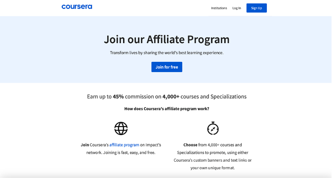
Right away, when you land on the page, you see a big title that says ‘Join our Affiliate Program.’ Then, just below that, there’s a little more text that tries to get you excited about the program by saying ‘Transform lives by sharing the world’s best learning experience.’”
In simpler terms, the page immediately tells you what it’s about (joining the affiliate program) and tries to convince you it’s a good idea by saying you’ll be helping people.
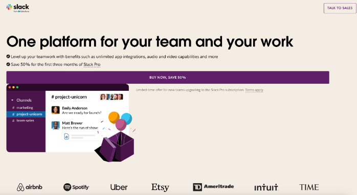
Tip: Add a sense of urgency or curiosity to your headlines to keep visitors interested. Take Slack’s landing page, for example. They try to get you to buy their product right away by offering a 50% discount if you purchase it immediately:
2. Make your CTA stand out
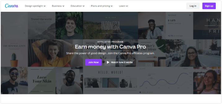
Your Call-to-Action (CTA) is what tells visitors what to do next. Make it bold and clear. Use action words like “Get Your Offer” or “Join Now” (just like Canva does). Avoid vague phrases like “Click Here.”
Tip: Try different colors and placements for your CTA button. Make sure it’s easy to find at the top and bottom of the page.
3. Keep forms simple
Don’t ask for too much information in your forms. Aim for no more than seven fields. A simple form makes it easier for visitors to sign up.
Tip: If you need a longer form, break it into smaller steps and show a progress bar. Make sure it works well on mobile devices.
4. Test different versions
Write clear and concise copy. Use bullet points and headers to make your points quickly. Always test different versions of your copy and CTA to see what works best.
Here’s what you can test:
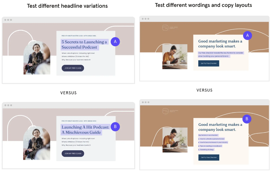
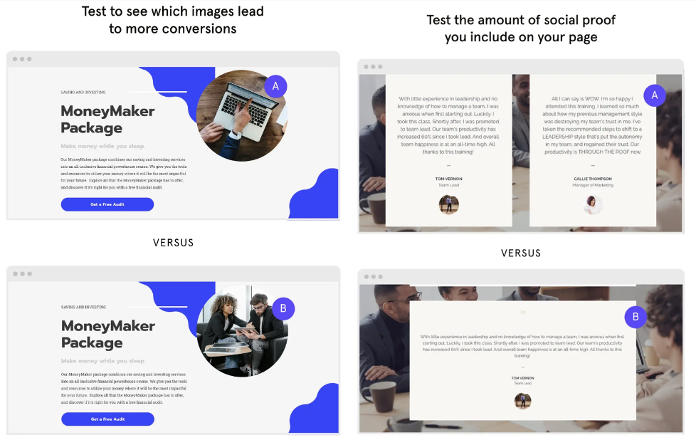
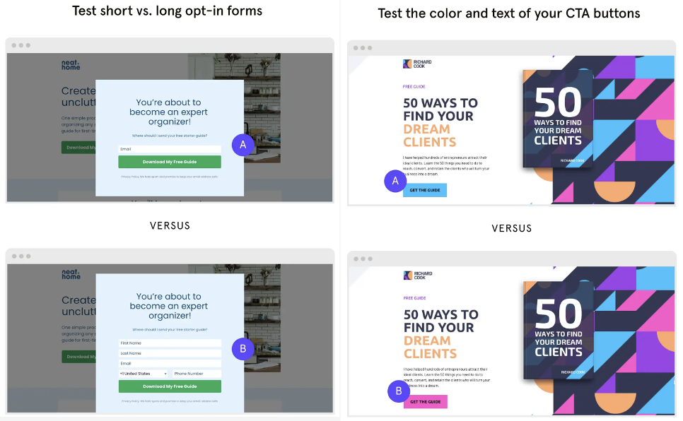
Tip: Pay attention to what the data tells you. Testing helps you understand what converts visitors.
5. Use social proof
People trust other people’s opinions. Include real testimonials with names and photos. Show expert endorsements and trust badges like “SSL Secured.”
Here’s how AdsEmpire do it:
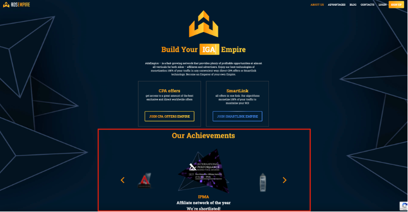
Tip: Use fresh reviews from sites like Yelp or Trustpilot. Place trust signals near your CTA to build credibility.
Let’s take Trainual as an example. Right below the “Get a demo” button, you’ll find a selection of reviews:
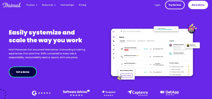
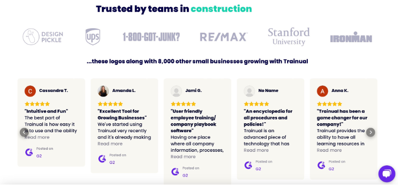
And if you scroll down a bit, you’ll see even more feedback from happy customers:
6. Ensure mobile-friendliness
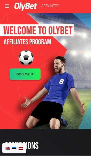
Many people use their phones to browse the web. Make sure your page looks good and works well on mobile devices.
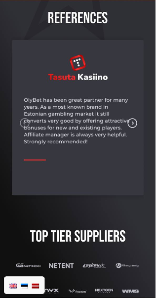
Here’s a great example of OnlyBet mobile landing page:
Tip: Optimize images and use AMP to speed up loading times. Aim for a load time under 3 seconds to keep visitors from leaving.
7. Place key information above the fold
Ensure critical elements like your headline, main offer, and CTA are visible without scrolling. This captures attention immediately and encourages further engagement.
Check out Pin-Up partners – their landing page is a perfect example of how to deliver key information instantly:
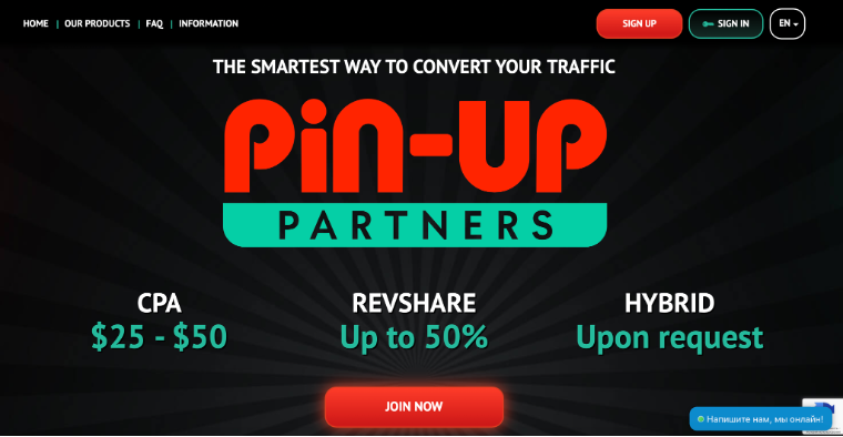
If you’ve noticed a pattern, you’re not alone! Both this example from Pin-Up partners and the previous one from OnlyBet prove that red and black landing pages are the go-to choice for Gambling Affiliate Programs.
There’s a reason for this — these bold colors are impossible to ignore, and together, they create a striking combination that grabs attention and draws you in. And if you introduce a touch of green into the mix, it becomes even more eye-catching.
8. Optimize for SEO
To help your page rank higher in search results, use a unique URL, optimize title and header tags, and write a good meta description. Name your images appropriately and focus on getting backlinks.
Tip: Include your landing page link in blog posts, website pages, and share it with affiliate partners to improve its search ranking.
9. Add a thank you page
After someone takes action, send them to a thank you page or show a thank you message. This confirms that you received their information.
Tip: Use the thank you page to offer more value or guide them to other relevant content.
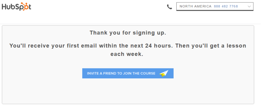
Example #1: HubSpot is keeping it simple but effective:
Example #2: Optimizely nurtures its leads
Optimizely does it a bit differently from HubSpot. After you download a guide from Optimizely, you’ll land on a thank you page. You can grab your guide right there with a handy download button (don’t worry, it’s also sent to your email!).
And that’s not all – below the download button, you’ll find some other articles and resources that might interest you. It’s a great way to keep promoting your stuff!
Example #3: Wrike is being strategic
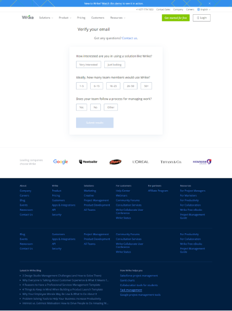
Wrike, a project management tool, does something smart on their thank you page. After you sign up for their free trial, they ask a quick 3-question survey. This helps them understand how serious you are about using their software and gives their team valuable info to help you better.
Plus, Wrike’s marketing team cleverly used the thank you page to build trust – they added social proof, which we’ve covered before. Seeing logos from giants like Google and Tiffany sends a clear message: ‘If they trust us, you can be confident in our services too.’
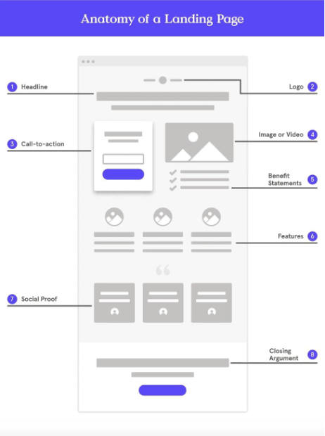
Let us share a helpful extra with you – here’s what goes into a landing page that actually works:
What is RichAds?
🔝 High quality push and pop ads,
🔼 domain redirect and native traffic source,
🔝 buy push ads at $0.005 (CPC), pop ads at $0.5 (CPM),
⏫ domain ads costs start from $1.5 (CPM), native ads — from $0.001 (CPC),
⏫ ad network offers large volumes of traffic in more than 200 geos from Tier 3 to Tier 1.
10 high-converting examples of landing pages
Below you’ll find top 10 examples of landers and explanation why they actually bring conversions!
1. Serious.Partners
This landing page really pulls in affiliate conversions! Serious.Partners is a prime example of how to build a landing page that attracts affiliates and gets them signing up. According to the Partnerkin team, it’s the best one among all the affiliate marketing landing page examples.
Let’s dive into what makes the Serious.Partners affiliate landing page effective, and where it could be even better.
High-сonverting practices:
- Strong call to action (CTA): The “Join us now” CTA is prominent, visually appealing, and repeated throughout the page. This encourages visitors to take the desired action. And here’s a cool touch: the benefits of joining the program are dynamically showcased, circling around the ‘Join us now’ button.
- Compelling headline: They use persuasive language that speaks directly to the target audience (“WE DO THE JOB — YOU MAKE MONEY”). This grabs attention and keeps visitors engaged.
- Social proof: Mentioning their client base and highlighting successful partnerships builds credibility and trust. They’ve got the social proof to back it up, featuring reviews from trusted sites like Trustpilot, Partnerkin, and more.
- Clean and professional design: The page primarily uses a blue and white color scheme. Blue is often associated with trust, stability, and professionalism, which aligns well with the brand’s message of being a reliable partner. The white provides a clean backdrop and enhances readability. The page is visually appealing and easy to navigate. The uncluttered design keeps the focus on the key information. The animated astronauts add a touch of whimsy and personality to the page.
- Mobile-friendly design: The page adapts seamlessly to different screen sizes, ensuring a positive user experience on any device.
2. V.Partners
The V.Partners landing page is clean, modern, and effectively communicates their value proposition. Maybe it’s not as visually appealing as Serious.Partners (there are no flying astronauts), but it still does its job extremely well.
Here’s a short breakdown of the high-converting practices they employ:
- The headline “Your traffic matters” immediately grabs attention and clearly states what V.Partners offers. It’s concise and impactful. Although there’s no subheading, it’s not that necessary and it doesn’t distract from the headline.
- Using ‘Start earning’ as the call to action is a smart move, likely resulting in higher click-through rates compared to the standard ‘Click here’ or ‘Join’.
- To build trust, they’ve included testimonials and showcased their achievements – letting their success speak for itself.
3. Mostbet partners
Mostbet is similar to V.Partners, but it stands out with more engaging images and a less minimalistic design. The “Register” button matches the logo’s color, making it pop against the dark blue background.
Even though the button simply says “Register,” it effectively gets the job done. This website is a great example of a landing page for Betting Affiliate Programs.
4. Alpha Affiliates
This one really stood out! The visuals of one of the affiliate website examples are stunning, especially the cat (giving us total lucky Chinese cat vibes!).
That, combined with a vibrant red CTA button against a cool gray background, creates a look that’s both minimalist and eye-catching. They also cleverly build trust with an awards section and a helpful FAQ to get to know the company better.
5. 1xbet
You know what’s really cool about this landing page? It’s clear the designers weren’t just going through the motions – they created something that actually makes you stop and look. The star of the show has to be their clever use of circular designs. Right off the bat, you’re greeted by this awesome spinning Earth with gaming items orbiting around it – think poker cards, sports balls, and boxing gloves. Pretty neat, right?
But wait, it gets better! They’ve added this subtle but hypnotic pulsing circle around their “Join us now” button that’s practically impossible to ignore. It’s like it’s gently nudging you to click it!
We fell in love with this page because it’s basically a masterclass in landing page design. They’ve nailed all the essentials: a crystal-clear call-to-action, a headline that grabs your attention, and all the important stuff right where you can see it without scrolling.
Partnerkin team
Plus, they’ve included those trust-building elements we all look for – customer reviews, partner logos, and even a handy FAQ section. It’s like they read our minds about what makes a landing page work!
6. ShipBob
Look at this landing page. Nothing special, right? But then you notice the toy trucks! I spent a good five minutes just watching them scoot back and forth.
These cute little 3D trucks represent ShipBob’s shipping partners, and they’re seriously mesmerizing. I was so distracted by them, I almost didn’t notice the missing call to action (CTA) button and the somewhat vague value proposition.
So, while the minimalist design, polished look, and strong graphics are great, the lack of a prominent CTA is a major conversion killer. Burying the CTA at the bottom of the page, below the fold, forces users to scroll down to find it, which many won’t bother to do.
This needs to be fixed ASAP!
7. TonyBet
This landing page caught our eye with its clean, minimalist design – it’s simple, yet surprisingly captivating. We especially liked the “Join Now and Benefit” button; it’s a clear call to action that highlights the value proposition right away.
Plus, showcasing a list of their providers is a smart move; it instantly builds trust and credibility by leveraging social proof.
8. Netflix
Netflix’s landing page is a masterclass in minimalism. Instead of clutter, they use a backdrop showcasing their massive library of shows — talk about a powerful visual!
The small, centered CTA button and the login tucked away in the corner are subtle but effective. They know their brand is strong enough to drive conversions without shouting.
9. Rippling
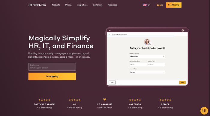
Rippling’s landing page nails clarity and social proof. The headline, “Magically Simplify HR, IT and Finance,” instantly grabs your attention. Then, they quickly tell you how they solve your problems: managing payroll, benefits, devices, and more – all in one place.
Before you even scroll down, you know this product is popular and solves a real pain point. Ready to learn more? Just add your email. Even better, Rippling tailors the landing page to your specific needs. Searching for HR solutions? You’ll see an HR-focused page. Need payroll help? They’ve got a page for that too!
Okay, if we’re really nitpicking, the “See Rippling” CTA is a bit vague. It doesn’t exactly tell you what clicking it will do. Turns out, it takes you to a demo booking form. So maybe Rippling knows exactly what they’re doing after all.
10. Pin-up casino
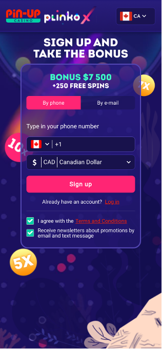
Last but not least, here’s a great example of a mobile-optimized landing page from Pin-Up Casino.
They know how to grab attention on the small screen, hitting you right away with a tempting bonus offer: “Sign Up and Take the Bonus.” Simple, yet incredibly effective.
Best landing page builders for affiliate marketing: Quick comparison
To make things easier, we’ve put together a handy comparison table of the best landing page builders:
| PRICING | FREE PLAN/TRIAL | KEY FEATURES | |
| Moosend | $9/month | 30-day free trial | Intuitive drag-and-drop editor |
| Instapage | $99/month | 14-day trial | Reusable content blocks |
| Unbounce | $99/month | 14-day trial | AI-powered builder |
| Leadpages | $49/month | 14-day trial | Built-in conversion guidance |
| ClickFunnels | $97/month | 14-day trial | Sales funnels |
| Landingi | $29/month | Yes | HTML & JavaScript support |
| GetResponse | $19/month | Yes (limited) | A/B testing, SEO tools |
| Wix | $17/month | 14-day trial | Robust analytics |
| Swipe Pages | $39/month | 14-day trial | Conversion-optimized templates, AMP support |
Our team has tested them all, so you don’t have to spend hours figuring out which one’s right for you.
So, let’s take a closer look at each one:
1. Moosend
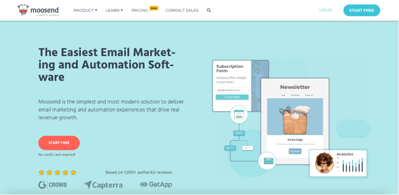
Moosend is a fantastic option if you’re just starting out or watching your budget. For $9/month (with a generous 30-day free trial!), you get unlimited landing pages, email marketing, and automation tools – all in one neat package.
It’s super user-friendly, with a drag-and-drop interface and a library of beautiful templates. Add countdown timers, forms, and videos to create those irresistible calls to action. The only downsides? No A/B testing and a slightly limited template selection.
- Pros: Affordable, all-in-one, easy to use.
- Cons: No A/B testing, limited templates.
2. Instapage
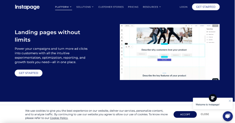
Instapage is the top choice for those who want high-converting pages and don’t mind paying a premium. Starting at $99/month (with a 14-day trial), you get access to AI content generation, 500+ customizable templates, and powerful A/B testing.
It’s great for WordPress users and offers real-time collaboration features. However, the price tag might be a bit steep for smaller businesses. A/B testing is also limited to higher-tier plans.
- Pros: Powerful features, A/B testing, AI content generation.
- Cons: Expensive, A/B testing on higher tiers.
3. Unbounce
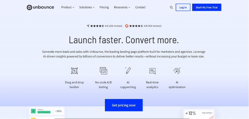
Unbounce is a modern platform perfect for affiliate marketers, small teams, and agencies. It has a powerful drag-and-drop builder, an AI-powered builder for a quicker start, and robust A/B testing (though again, this is on pricier plans).
It integrates seamlessly with many other tools. While powerful, it can feel overwhelming if you just need a simple solution, and it carries a hefty price tag of $99/month (with a 14-day trial).
- Pros: Powerful features, AI assistance, robust analytics.
- Cons: Expensive, can be overwhelming for beginners.
4. Leadpages
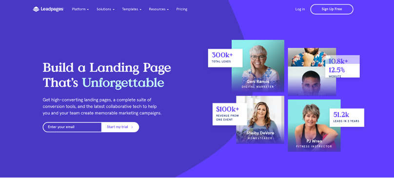
Leadpages offers a great balance of features and affordability. At $49/month (with a 14-day trial), you get access to 200+ mobile-friendly templates and a user-friendly drag-and-drop builder.
The built-in conversion guidance is a major plus, helping you predict your page’s performance before launch. However, the cheaper plans limit you to just 5 landing pages.
- Pros: Affordable, conversion guidance, fast loading pages.
- Cons: Limited landing pages on cheaper plans, limited form customization.
5. ClickFunnels
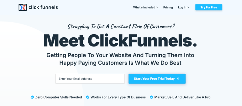
ClickFunnels is a powerful platform for building complete sales funnels, not just landing pages. It’s packed with advanced features like surveys, video pop-ups, and automation workflows, making it ideal for experienced affiliates. But it comes with a hefty price tag of $97/month (with a 14-day trial) and a steeper learning curve.
- Pros: Powerful funnel-building capabilities, advanced features.
- Cons: Expensive, steep learning curve.
6. Landingi
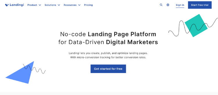
Landingi offers a pixel-perfect drag-and-drop builder with 400+ customizable templates that are mobile responsive and fast-loading. It shines in its detailed analytics and A/B testing capabilities. While it has a free plan, it’s very limited. Paid plans start at $29/month.
- Pros: Many templates, detailed analytics, A/B testing.
- Cons: Very limited free plan, some features lack clear guides.
7. GetResponse
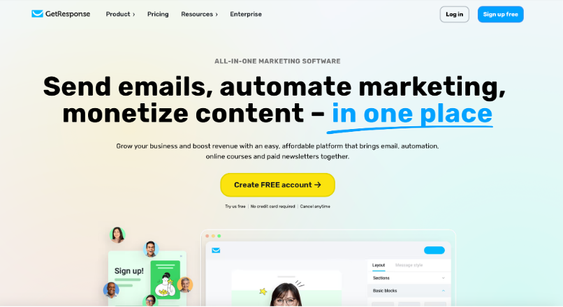
GetResponse is a marketing automation platform that includes a user-friendly landing page builder with AI assistance and 200+ templates. It offers live chat, autoresponders, and advanced automation, but the pricing increases quickly to access all features. Plans start at $19/month.
- Pros: Unlimited landing pages, advanced automation, live chat.
- Cons: Free version is heavily limited, website builder needs improvement.
8. Wix
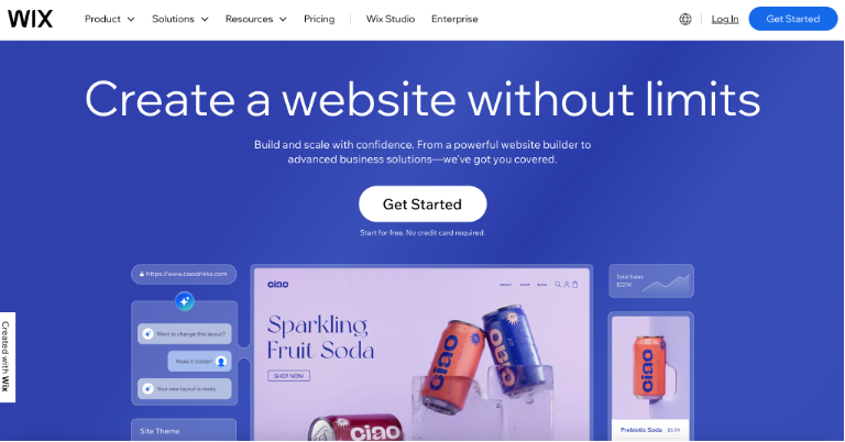
Wix is a popular website builder that also offers excellent landing page creation tools. It’s beginner-friendly, affordable (starting at $17/month), and includes e-commerce functionality. It also has strong analytics and AI assistance.
- Pros: Beginner-friendly, affordable, e-commerce capabilities, strong analytics.
- Cons: Bandwidth and storage limitations on lower tiers, ads on the free plan.
9. Swipe Pages
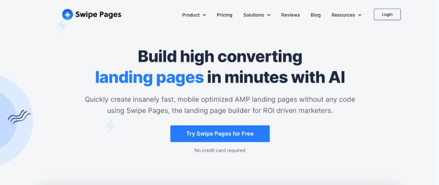
Swipe Pages focuses on creating fast, mobile-optimized landing pages, crucial for higher conversion rates. It has templates specifically designed for affiliate marketing and an AI-powered page builder. The pricing starts at $39/month.
- Pros: Fast mobile pages, templates for affiliate marketing, AI assistance.
- Cons: Advanced features on higher tiers, some features have a learning curve.
How to choose your perfect match?
The best landing page builder for you depends on your budget, technical skills, and specific needs. Consider what features are essential (like A/B testing or AI assistance), and don’t be afraid to take advantage of free trials before committing.
Conclusion
Best landing page for affiliate marketing doesn’t happen by chance. You just need to follow the right steps. Use the tips we shared and learn from the ten examples you saw. This will help you earn more money from your affiliate work.
Keep trying new things on your pages to see what works best. When you find something that works, make it even better. Now go out there and create landing pages that turn clicks into cash!
What is RichAds?
🔝 High quality push and pop ads,
🔼 domain redirect and native traffic source,
🔝 buy push ads at $0.005 (CPC), pop ads at $0.5 (CPM),
⏫ domain ads costs start from $1.5 (CPM), native ads — from $0.001 (CPC),
⏫ ad network offers large volumes of traffic in more than 200 geos from Tier 3 to Tier 1.
The post 10 high-converting landing page examples for affiliate marketing: best practices for 2025 appeared first on RichAds Blog.
