Pre-landing page examples for leading verticals

In the affiliate marketing pre-landing pages perform as a boost for ad campaigns, as they warm-up the audience for the offer and provide a first step to it. But what approaches exist for pre-landers? Do verticals affect the way a pre-lander should look?
Let’s get into prelanders for top verticals in the affiliate marketing, and determine how to utilise them.
In this article we will tell the purpose of pre-landers, share tips on creating pre-landing pages, and show pre-landing page examples in the affiliate marketing.
Why do we need a pre-lander?
In the affiliate marketing, a pre-landing page “warms up” the audience before they perform a desired action. It helps the users to get familiar with the offer and highlights why they need it.
Prelanders are commonly used for advertising with popunders, since there’s only one creative needed for pops — a landing page, pre-landing pages serve as a doorway to get audience warmed-up. Prelanding pages are also used to promote with native ads and push ads. In either case, pre-landers aim to ensure engagement with the offer and further intention to proceed.
What does a pre-lander do?
- Increases user’s interest in the product
Pre-landers aim to make the first interaction with the product as much engaging as possible. They provide a highlight of the experience people expect to get in the offer the most. - Provides comprehensive information
Prelanders present the offer in a shortened yet illustrative manner, so that users can get a fast hint on the product. - Clearly demonstrates the results
Sometimes pre-landers present not only the offer but the expected outcome of its usage. That increases the value of the product in the eyes of the audience, as they get the picture of it as a whole. - Increases motivation resulting in getting leads
As pre-landers perform all the actions to advertise the offer in the stage before actually getting to it, the more they get — the higher the motivation is to use it as they see it. - Eliminates untargeted traffic
With pre-landers the audience is more likely to get the main idea of the offer and what to expect next. That results in increasing conversions from the already interested part of users, and filtering the part that is not the targeted audience.
What should we consider while creating a pre-landing page in the affiliate marketing?
Since a pre-landing page serves as a doorway from the ad to the offer, it’s important for a prelander to make the right impression on the audience. In order to increase the performance of the pre-landing page, you may consider the following: target audience portrait, providing reviews for the product, and approaching via storytelling.
1. Determine the target audience
First, you need to define the portrait of the audience you want to target by the prelander. You might start off with what the targeted audience expect from the offer, what outcome they want to see, and how to show all of that in a maximum efficient and representative manner. This way, it will be easier to create a unique selling proposition and highlight the benefits that ‘hook’ the user, hence, securing guaranteed lead generation.
For example, Gambling audience from lower Tier countries perceive online casinos and sportsbooks as a way to make money, while the Gambling audience from higher Tier regions consider gambling as a sort of entertainment. These polarities can be a base to define what audience should be targeted with the pre-landing page only selected by the Tier of their country in the affiliate marketing.
RichAds team
Also, a well-compiled pre-landing page increase the CR as you can utilise different approaches to the every bit of the audience.
2. Provide a showcase of warranties or reviews
Usually, to increase audience loyalty, product reviews are posted on pre-landing pages. You can also build customers’ trust with:
- product certificates;
- medically confirmed product safety;
- celebrity interviews;
- reviews and feedback from opinion leaders (e.g. a world poker champion);
- warranties on the product or results.
3. Utilise storytelling
It is a marketing tool that uses cases and stories to encourage the target audience to perform the intended action. Simply put, tell the user an interesting story about your product.
Try to avoid:
- humor, otherwise, the user will quickly lose their trust in the product;
- aggressive encouragement and cheesy calls to action;
- obvious deceptive practices and scams.
Pre-landing pages examples for 10 top verticals in the affiliate marketing
In this part we will show some examples and approaches of pre-landers in the affiliate marketing. Note, that prelanding pages for verticals might vary in the terms of functionality of the pre-lander or approaches of the ‘hook-up’.
We will show examples of the pre-landing pages for following 10 affiliate marketing verticals:
- E-Commerce;
- Gambling;
- Sweepstakes;
- Nutra;
- Gaming;
- VPN;
- Dating;
- Media;
- Finance;
- Utilities.
1. E-Commerce
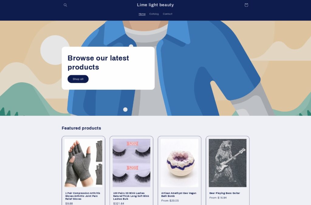
The purpose of the pre-landing page: to show the catalogue of the most interesting products; imply the idea how easy it is to purchase; demonstrate that users even win by buying here at these prices.
Pre-landers for E-Commerce offers vary depending on the product, but the main is pretty much the same — demonstrate the product and make an impression that it’s an exclusive offer. Mostly, such prelanders contain a listing of the most interesting products, sometimes paired with big bannering ‘Sale’ header.
For example, the pre-landing page looks like a website shop with the most interesting products. Such pages provide a full legitimate appearance, showing the goods and a way to buy them straightaway. Generally speaking, the pre-landing page looks like a full-fledged commercial website. The buttons on the page offer to go to the official website of the manufacturer or supplier to order the product.
What is RichAds?
🔝 High quality push and pop ads,
🔼 domain redirect and native traffic source,
🔝 buy push ads at $0.005 (CPC), pop ads at $0.5 (CPM),
⏫ domain ads costs start from $1.5 (CPM), native ads — from $0.001 (CPC),
⏫ ad network offers large volumes of traffic in more than 200 geos from Tier 3 to Tier 1.
2. Gambling
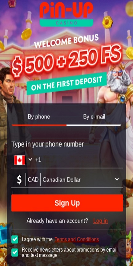

The purpose of the pre-landing page: to demonstrate that online casinos are easy money and interesting simple games; let feel the courage of games; show how many bonus and welcoming prizes they might be getting.
Pre-landers for Gambling vertical offers usually consist of two types: a free-spin wheel or a welcome bonus page with a simple registration form. A free-spin wheel (also known as a ‘fortune wheel’) encourages users to take a first step, which will cost them nothing but promises a lot of bonuses in the end. A bonus promising page will also do, as users can see what they will get straight away in a highlighted and clear form right above it.
For example, the pre-lander is designed as a free online game. After passing it, the user will get a bonus when registering or making a deposit. Upon the victory, the user would want to play more, which means that they are ready to become a lead. On the pre-landing page, you can place a tempting offer with a button saying “Play Now” or “Hit the Jackpot”, etc.
3. Sweepstakes
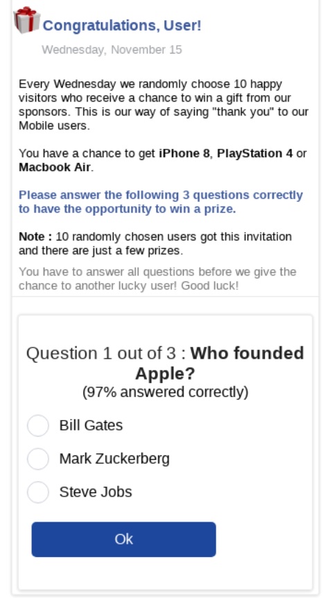
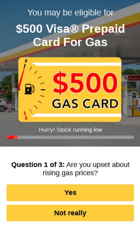
The purpose of the pre-landing pages: to motivate the user to become a lead; to convince them that they don’t lose anything. On the contrary, they might get a valuable prize.
For Sweepstakes offer a survey-themed or quiz oriented pre-lander is considered to be the most popular option. Such prelanding pages allow users to engage with the offer via an illustration that they make an effort to be selected, thus potentially getting an increased chance to win the prize.
For example, you can use pre-landing questionnaires for Sweepstakes: “Are you satisfied with your phone?” The pre-landing page button leads to the landing page and can encourage users to take action: “Win a new phone.” Sweepstakes for pre-landing pages can look like a gift shopping page. The buttons, of course, will lead to the landing page for the user to register or fill out the participation form to enter the giveaway.
RichAds revealed what attracts the target audience in the “Complete guide to sweepstakes in affiliate marketing”. The same techniques can be used for the pre-lander. You can offer your users to try their luck by spinning the wheel of fortune. The button might say “Take the prize.”

4. Nutra

The purpose of the pre-landing page: show the real results after using the product. You can use before/after photos, opinions of doctors, comments, analysis of the ingredients, and overviews of the product’s properties.
For Nutra offers pre-landers serve a purpose of showing a science-based approach behind the distribution. Such pages advertise via illustrating how much of a research put into the development of the product and covers all the questions people might have for it in advance. This approach builds a trust around the product, proving it’s what it claims to be, and that it can be clear about that. Users get a feeling they have enough knowledge and are ready to perform a targeted action.
For example, the landing page example contains a common for Nutra advertisement in the affiliate marketing ‘science-research’ of the product. It can show all the back data, provide credentials of the specialists, touch related topics on physiology in a simple manner so that it remains comprehensible. Practically, such pages look like a research article, leading users to feel that they’re getting as much as a doctor’s appointment treatment. The buttons on the page redirect users to the website where they can purchase or place an order.
5. Gaming

The purpose of the pre-landing page: to show the graphics in all its glory; to make users interested in the gameplay.
For advertising gaming offers the pre-landers with a simple depicting of the game are considered to perform the best. Users must get the idea of how entertaining or unique or advanced the game is, but making sure it’s only one step away from playing it. The bridge between seeing the page and playing the game must be presented as a matter of seconds.
For example: on the pre-landing page, there might be colorful screenshots, a promotional video about the game, a small description, or a choice of choosing a playable character. Usually, it’s a single-page pre-lander, and the button says “Play” or “Download”.
What is RichAds?
🔝 High quality push and pop ads,
🔼 domain redirect and native traffic source,
🔝 buy push ads at $0.005 (CPC), pop ads at $0.5 (CPM),
⏫ domain ads costs start from $1.5 (CPM), native ads — from $0.001 (CPC),
⏫ ad network offers large volumes of traffic in more than 200 geos from Tier 3 to Tier 1.
6. VPN
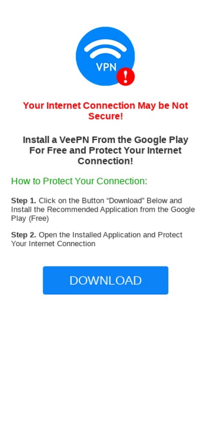
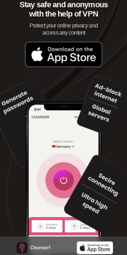
The purpose of the pre-landing page: to show the need of the VPN service; to demonstrate the benefits of daily VPN usage.
For VPN offers the prelanders provide two advertising opportunities — highlight the need of VPN and the benefits of it. First approach is to demonstrate how restricted the internet surfing can be without VPN, what servies are out of reach without it, or what problems might come if it’s not used. The second one mostly relies on showing how beneficial a VPN usage on top of what users experience on a daily basis. Both make people think of situations related to VPN, such as online privacy, comfort and enhancements.
For example, a prelander might highlight that without VPN an internet connection might be not secure, or even is in danger right now. Or it might highlight that with VPN one can access features that ensure privacy and global access to the most used sources. All of that usually is demonstrated with a logo of the product, short but catchy description in a few points and download button that lead to the online app or extension marketplaces to install the VPN tools.
7. Dating


The purpose of the pre-landing page: demonstrate the attractive materials; engage users with new experience; personalise the offer.
For Dating vertical offers it is common that pre-landers contain interactive approach or mind-blowing concepts. Interactive features might be a questionnaire to present the idea of how thorough the matching algorithm is or how valuable the participant of the service are. The unexpected concepts of the pre-landing pages might consist of catchy descriptions to make an impression that this website is nothing near the negative experience people could’ve had in the past. That ensures at least considering the option to see the offer that can be shortened via letting a peek on the content.
For example, on the Dating niche prelanders can be listed photos and videos of the other users of the website, or their profiles. Additionally you can add interactive features as specifying preferences form or a a couple of questions. After either is finished, users get redirected to the app or a website to register.
8. Media

The purpose of the pre-landing page: show the entertaining side of the product; highlight the easy start to use; picture the expected common-valued advantages.
Media niche pre-landing pages usually follow a simple yet very understandable way of advertising — showing emotions from the product. Although the Media products might vary from streaming services to YouTube videos, the presenting of how positively the people are affected by them is at the core. A sweet plus would be letting users know that such entertaining possibility can be achieved right away and lies in a couple of clicks. That ensures keeping the engagement level right to the performing of the targeted action.
For example, on the pre-landing page example can be a photo/video demonstration of the product or its users enjoying it. The buttons usually present a simple call-to-action ‘Sign up’ or ‘Learn more’ and redirect to the service official page.
Helpful tip!
Make sure the pre-lander is loading faster than 1 sec, and isn’t heavier than 200Kb. That increases the chances for it to engage the users as they won’t wait for the ad to show for a long time! For more info on optimizing landing pages check out our article here.
9. Finance

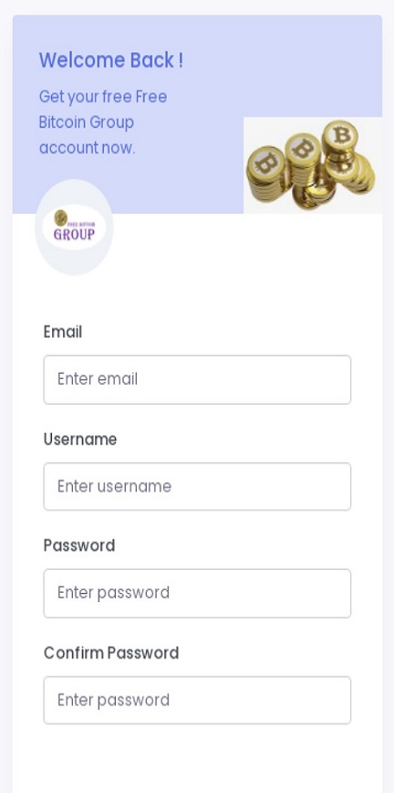
The purpose of the pre-landing page: tell a success story and show the results after using the product. This is where storytelling comes in handy.
The Finance offers’ pre-landing pages usually diverse highly depending on the exact offer. The trading platforms present product along with promising bonuses and and easy-to-go start after registration. Others might pack the advertisement into a success story, showing how a regular person has achieved a fortune. Approaches can be various, as long as they present the product as a way of making a lot of money with minimal investments.
For example, the pre-landing page looks like an article in a personal blog. These pages can contain comments, photos, social media buttons. Generally speaking, the pre-landing page looks like a private blog for a small group of enlightened people. The buttons on the page offer lead to a landing page where users can examine the product and registrate.
10. Utilities
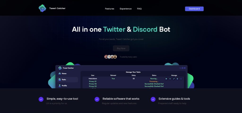
The purpose of the pre-landing page: highlight the product’s main features; demonstrate the simplicity of user-experience.
Pre-landing pages for Utilities vertical usually perform as a self-service page where people can get familiar with the functionality and benefits of the product. Such approach provides calculated reaction of the audience as in ‘it speaks for itself’. Utilities prelanders rely on external simplicity for the users, both in usage and visual, engaging as it offers the service affordable and highly valuable.
For example, on the pre-landing page there can be described features of the product in a points form or any additional such as introduction video. Also ratings and reviews from the real people might be much more convincing. The page buttons usually lead to the landing page with the offer or a landing page of the official platform website to download.
What is RichAds?
🔝 High quality push and pop ads,
🔼 domain redirect and native traffic source,
🔝 buy push ads at $0.005 (CPC), pop ads at $0.5 (CPM),
⏫ domain ads costs start from $1.5 (CPM), native ads — from $0.001 (CPC),
⏫ ad network offers large volumes of traffic in more than 200 geos from Tier 3 to Tier 1.
Conclusion
Pre-landers serve a purpose of an additional engagement stage with the audience, that secures the lead quality and warms up users before showing the offer. Also prelanders are open for experimenting on advertising approaches, as the more diverse the hook is, the higher chance to target every bit of the audience. Now, knowing how pre-landing pages operate within the affiliate marketing by these examples, you can consider utilising them in your ad campaigns.
We at RichAds approve of using pre-landing pages for ad campaigns, since they’re helpful on providing a boost in performance. Also, we’ve prepared our platform to be capable of running ads with full addition on push ads, pop ads, in-pages, direct click and native ads! You can launch a campaign on over 220 geos worldwide from Tier 3 to Tier 1 and get profit from RichAds’ quality traffic!
What is RichAds?
🔝 High quality push and pop ads,
🔼 domain redirect and native traffic source,
🔝 buy push ads at $0.005 (CPC), pop ads at $0.5 (CPM),
⏫ domain ads costs start from $1.5 (CPM), native ads — from $0.001 (CPC),
⏫ ad network offers large volumes of traffic in more than 200 geos from Tier 3 to Tier 1.
The post Pre-landing page examples for leading verticals appeared first on RichAds Blog.